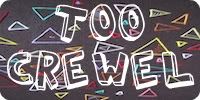
Aside from it being, you know, generally not good, notice anything funny about this scrapbook page I made in Tracey‘s store during my Thanksgiving trip to Ohio?

I knew something was wrong with it when I glued it down, but I just couldn’t figure out what.


9 Comments
Awww. Someone isn’t so good with a’s.
Nor matching colors, nor not featuring multiple photos of herself eating, nor a lot of things.
Thanks for pointing out the problem for the many other readers who wouldn’t have noticed it, because you know they’re out there.
I try to help, in my little way, every day.
*Rainbow*
So you’re saying I shouldn’t feel bad that it took me, like, five whole minutes to recognize the error?
OK, good.
Your man doesn’t look happy in any of those pictures… Did he know you were going to put them on a mural?
It’s not a mistake! It’s purposely backwards, like the “R” in the Toys R Us logo. Right?
Also, I’m so impressed you’re so willing to out yourself as a scrapbooker to all of your cool New York friends!
Like OMG I seriously made the EXACT same mistake putting up a bulletin board in my classroom last week, and it also took me a good three minutes to figure out what the problem was. In my defense I write my lowercase “a”s the same way this very font does, so I don’t have to actually know what any other “a” looks like….right?
Oops!
I’m so excited that I’m not alone in the general not-goodness of my scrapbook pages. They always look fancier in my head before I start gluing things down.