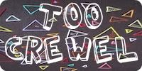
Weeks ago, my friend Eric Google Buzzed the latest Cee-Lo Green song, “F*** You”, and I thought the video for it was genius. The song is super-catchy to begin with, but when you present the lyrics in such a playful way, you’re begging people to watch and remember them.
I was showing the video to my friend Anthony yesterday, and he informed me that this is a whole video movement called kinetic typography, of which there are about 8 zillion examples on YouTube. Here are a few of my favourites:
Now find me some more or let me know what you like best!


5 Comments
I love love love the Cee lo Green song and that video (the one with the acting and people in it is way less entertaining).
If I weren’t super gee dee busy packing up my whole life, I’d totally watch the rest of these.
But don’t you love that I comment despite not actually checking out the post?
That’s dedication. Sort of.
It’s weird when watching a bunch of words is better than watching some poor little kid curse all over the place, right? Later in the week, I’ll post my OTHER favourite Cee-Lo song and its equally-awesome video just for you.
Also, could you please come and pack my apartment up for me after you’re done. So far, one of my co-workers had asked $5k to do it, so beat that offer.
I do appreciate your comment despite not having any idea what you’re talking about, but you should at least watch the “Kill Bill” one to procrastinate while you should be packing.
Wait, you’re moving? Where? Moving in with Kamran??
I LOVE these. Especially the songs!
Me, too! Some of the movie ones do more interesting things with the text, but there’s nothing like reading along to the words of a song you love. It reminds me of how I used to sit with the inserts to new CDs for hoooooours and try to learn the lyrics.